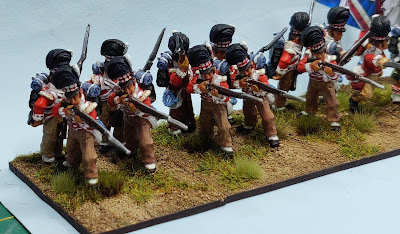
...have mustered in and are to be posted to the Army of the Pendawar Presidency. They were the subject of a short post last month, so no need to say over much about the regiment here ~

The figures are from Wargames Foundry, sculpted back in the day by the Perrys, while the flags are from GMB Designs and the bases are from Warbases as ever. As an experiment I bought a pot of GW Contrast paint, Snakebite Leather, to try on the horse of the mounted Colonel. As you'll know from all my moaning on I really don't like painting horses much at all. So, I thought I'd give the Contrast a try out, figuring most folk could forgive one horse if the outcome was poor. From my view the jury is out. I quite like the effect on the horse's mane and tail, but I'm less keen on the look of the body of the beast. Any and all opinions or advice welcome on this front. No more wittering on, here are a few group pictures ~


Next under the brush are the second HM Regular regiment of infantry I'm adding, the 76th (Hindoostan) Regiment. These are using the Perry Miniatures British from the Napoleon in Egypt part of their Napoleonic figure range. My modest painting target this month is to complete the 28 figures for the regiment, a target I failed by 4 to achieve with the 74th last month! As in January though I'll intersperse the figure painting with the painting and modest modelling of the 15mm MDF buildings for my CWGH mini project. Next up there are a house and barn for a small farm. Well, it passes the time for we geriatric-in-waiting folk if nothing else...
Very splendid they are Sir. Never thought that contrast paint was overly effect without plenty of contour for it to fall into. Watching folk on YouTube using it they appear to spend a lot of time after applying it to get it how they want it to look.
ReplyDeleteThanks Phil! I rather naively expected it to self shade and highlight. It's a bit of a dog's breakfast in truth, but it'll have to do now.
DeleteVery nice and Scottish to boot. I too was sceptical about Contrast paints for historical use, but I have used a red, white and blue on my SYW figures along with Snakebite leather and am very pleased. Having painted some fantasy figures recently with more of the range I am again very pleased with them, so much so that I have bought more for the big, colourful, Italian Wars period with all that slashed clothing etc.
ReplyDeleteNo doubt there are several Anderson's on the roll! I'm not sold on Contrast paints if I have to undercoat over white and then highlight. Can't see the advantage then.
DeleteI just pop them on an undercoat, I have never highlighted anything. Shaded but never highlights.
DeleteI was looking hopefully for a one coat simple solution.
DeleteThere isn't one!
DeleteSadly you may be right.
DeleteLovely unit David. Re the horse, Ive used contrast paints for a while now specifically for my horses. Ive found the best results depend on the undercoat. For Snakebite leather I use either a very deep yellow or a colour from Valejo called horse red?? I also suggest after the horse has been covered and allowed to dry give the prominent parts of the horse a highlight in the original undercoat colour. It seems to work well for Perry horses. The tail and mane I usually wash with a very dark colour mainly black. Ive also found if you undercoat your horse black, then give it a coat of very dark brown but keeping the colour out of the creases and then use wyldwood it gives a decent look to the horse.
ReplyDeleteThanks Robbie for the thoughtful and detailed advice. See my reply to Phil and George above for a summary of my disappointment.
DeleteI like 'em, David!
ReplyDeleteThank you Jonathan, much appreciated.
DeleteNot bad for a dog's breakfast. Although I think they prefer sausages Mr.B.
ReplyDeleteThank you Esther!
DeleteI agree with you about the contrast paint on the horse...the mane looks good but body not so much. I haven't used contrast but it's just like other styles I guess, practice makes perfect. If you look at my Red Rowan post in Jan, there are several if your favourite Dixon ACW figures painted using the contrast method by a very talented mate of mine....they look pretty impressive!
ReplyDeleteAs with most techniques, practice will obviously improve results. Only one horse in the unit on the painting desk now, the Colonel of the 76th Hindoostan Regiment, then the 12 Trent Miniatures Scots Greys, the latter not really using the technique...
DeleteA grand looking unit David…
ReplyDeleteI undercoat my horses a shade of brown before using Contrast Colours…
Also doing two coats diluted with the Contrast Medium evens the coverage out a bit more.
I have heard that Army Painter are doing their own version of this… I may give it a try and see if it behaves differently.
All the best. Aly
Thanks Aly. As I've confessed I was looking for a one process solution to my least favourite part of painting, ruddy horses! Wasn't impressed by the product, it didn't do what it said on the tin, so as to speak.
DeleteAnother nice unit for the collection Mr.B. As far as horses go the ones you've done using Foundry's assortment horsey colours have always looked perfectly fine to me.
ReplyDeleteThank you Jon, much appreciated. As to horses I fear you are probably right. Old dog new tricks perhaps plays a part?
Delete