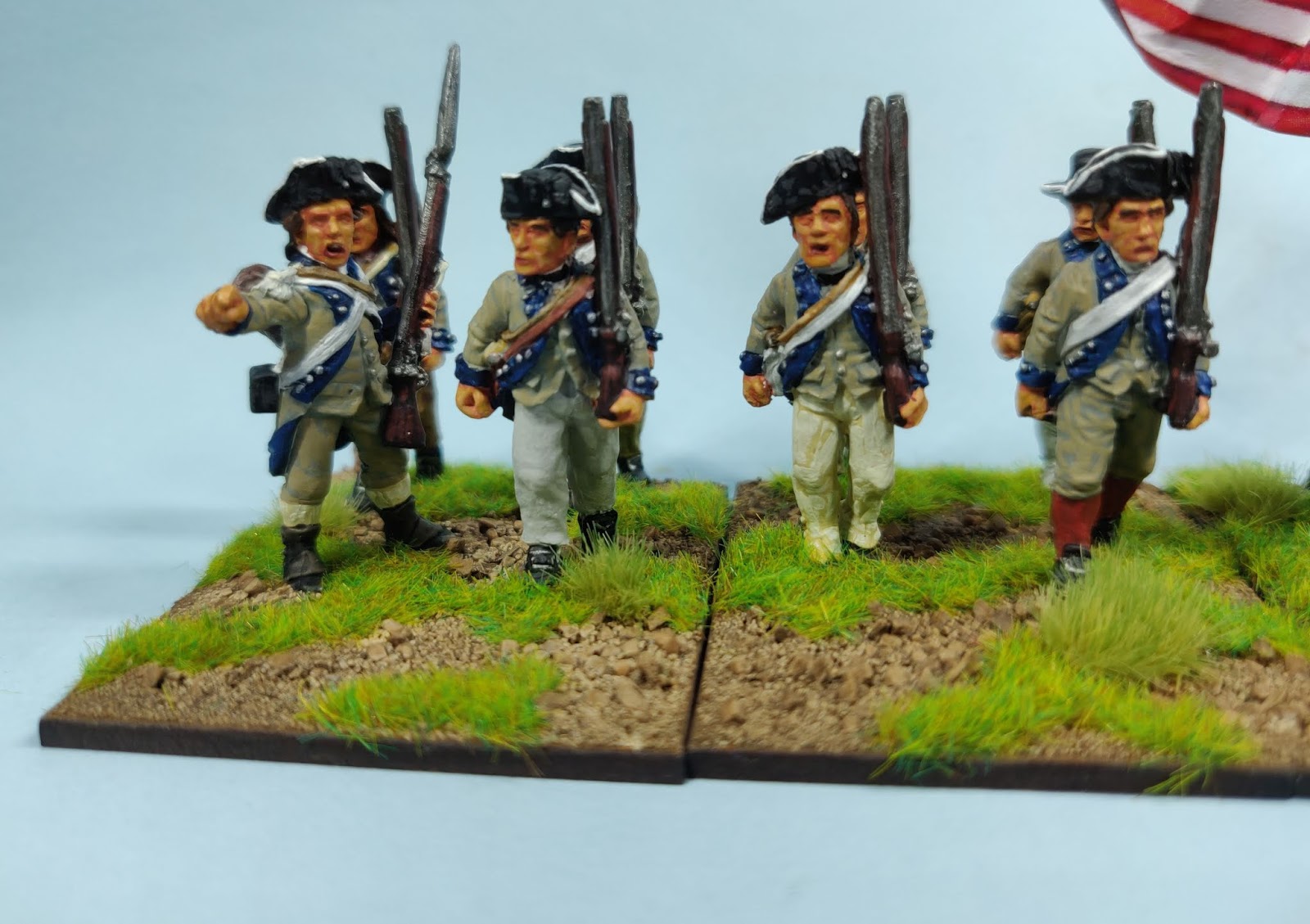
The last American, or Rebel unit if you prefer, for my AWI expansion project has been completed at last. The figures are once more the venerable
Foundry miniatures, sculpted back in the day by the Perrys. I don't anticipate adding any more units at present, even though I've several sprues of free plastic figures from Wargames Illustrated via my friends. I chose them to represent the 3rd New Jersey and based them on a Don Trioani print featured in his
Soldiers of the American Revolution ~
The flags are from two sources: the free downloads from Clarence Harrison, now sold by
Warfare Miniatures, and one I found on the net for the 3rd New Jersey. No idea if the latter is right, but it's different! I also found this more contemporary picture a useful source for determining the uniform coat colour ~
As is usual for these posts, here they are firstly drawn up in line, and then featured in some closer shots, the latter for those of a strong constitution ~
This leaves me with just the 45th Foot for the crown's forces and I'm done, at least for now. After those I've some SYW artillery and crew and some War of 1812 Americans in the queue. Mind you, when I collect my
Eureka order from Colin at
Partizan that might all change! We shall just have to wait and see.


Lovely work David:)
ReplyDeleteThank you Steve J.
DeleteWhat a splendid regiment David, well done!
ReplyDeleteMany thanks Phil.
DeleteSaw these in the flesh earlier, very tasty and a batty looking flag too. Is it right, who cares, hiss boo to any neigh Sayers.
ReplyDeleteThanks for the encouragement Phil!
DeleteNATTY, do these spell checkers not speak gibberish?
ReplyDeleteSpoll chuckers?
DeleteA nifty looking regiment David!
ReplyDeleteChristopher
Thanks for the kind words Christopher.
DeleteI always liked the colour scheme of this regiment and a very dapper job you have done of them David. Well done.
ReplyDeleteIt was the uniform which attracted me in the first place so I'm glad you also like it.
DeleteVery nice David...
ReplyDeleteLight grey and dark blue may threaten to be a bit dull.... but it certainly isn’t.
All the best. Aly
Thanks Aly. Foundry Granite Light as the base, Foundry Drab Light for highlights, gives it the slightly yellowish tinge I hope.
DeleteVery nice and inspiring flags, who wouldn't march under them.
ReplyDeleteWell, being English, I have to say not me!
DeleteGreat looking unit,I really like the colour scheme and the flags are great!
ReplyDeleteBest Iain
Many thanks Iain! Glad you approve!
Delete